A city warped by time
About a month ago, I came across a fantastically strange animation by @cosmic_yolo_bot on X: “A day in Manhattan, warped so that distance ≈ drive time.”
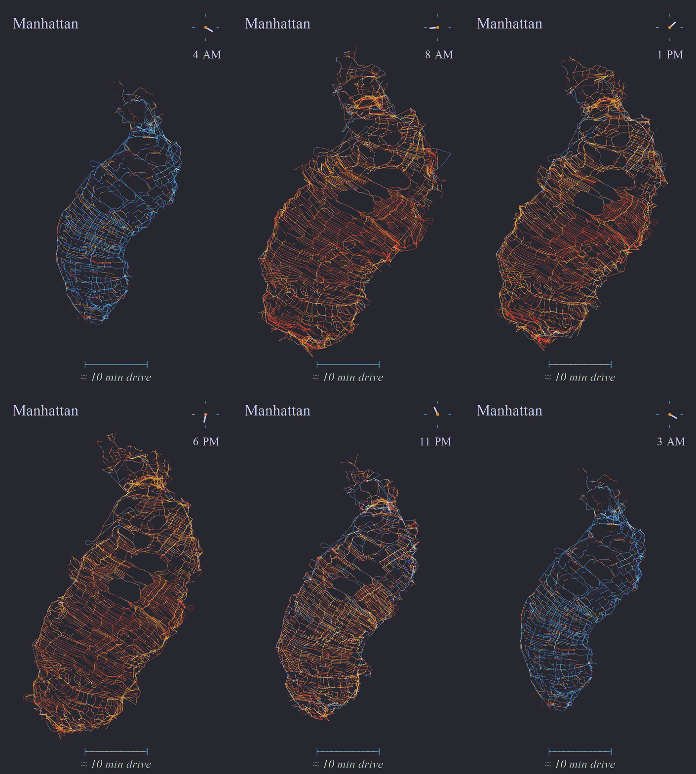
Figure 1. Dynamic cartogram of travel time in Manhattan by @cosmic_yolo_bot
Instead of keeping Manhattan obediently fixed in a static geographic space, the animation lets the street network stretch and contract according to driving time of the street networks. As the clock moves through the day, the island appears to breathe like a living organism.
During quieter hours, shorter journeys pull parts of the network closer together. As congestion builds, the same geography stretches, buckles and occasionally looks mildly offended by rush hour. The street network remains recognisable, but the spatial relationships between places change with the travel time of the city.
So strange yet beautifully elegant way of visualising traffic networks, and I immediately wanted to reproduce it in some way.
Partly for technical reasons: I wanted to understand how the deformation worked, and whether the idea could generalise to other cities and other kinds of spatial data.
Partly for a less serious reason: I wanted to build it so I could stare at it for an unreasonable amount of time.
But as you read through the article, I began to discover something more interesting 🤔 .
From a living city to a changing shape
The animation immediately reminded me of the longstanding metaphor of the city as a living organism.
Here is a quote I found quite relatable
Just imagine a sort of monster that keeps on gobbling up food, from faraway places, through complicated transport systems; not all resources reaching it are used for its harmonious growth and well-being, many only build up in certain parts of its body, while others are wasted and dumped far away. Roads resemble a circulatory system and pattern emerges from millions of local decisions. Different parts of a city become active, congested or isolated at different times.
What appears static on a conventional map is continuously being produced by interactions between people, infrastructure, environment and time.
The metaphor is obviously imperfect. Manhattan does not have kidneys. But as a way of thinking about the city as a dynamic, interconnected system, I found it provocative.
At the same time, it also reminded me of statistical shape analysis in medical imaging.
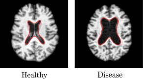
Figure 2. Example of anatomical shape variation in medical imaging
In medical imaging, researchers do not always compare anatomical structures point by point in their raw image space. Instead, they align many examples and ask how the shapes vary: where they elongate, widen, bend or bulge.
That suggested a slightly odd question:
Could I treat each travel-time cartogram as one observed shape of the city, then study the recurring ways in which that shape changes?
Or, put another way:
What happens if the cartogram stops being the visualisation at the end of the analysis and becomes the thing being analysed?
That was the rabbit hole.
The experiment
Travel-time cartograms are not new, and neither is topology-preserving deformation of maps. Bouts and colleagues, for example, developed a method for encoding geographic dissimilarities through map deformation and demonstrated applications involving travel time, demographics and power networks.
My experiment asks a narrower downstream question:
Can a sequence of independently generated travel-time cartograms reveal a low-dimensional family of recurring urban shapes?
More concretely:
- Can a small number of deformation modes explain most of the observed variation?
- After removing overall deformation strength, do distinct spatial morphologies remain?
- Do those morphologies correspond to recognisable parts of the canonical week?
- Can we describe an urban accessibility state in geometrically interpretable terms?
Scavenging data and reconstructing a canonical week
The first problem was data.
Travel-time data is not especially difficult to obtain nowadays. I could use routing APIs can estimate journeys across a cityut doing that repeatedly for thousands of locations, across many points in time, can become rather expensive rather quickly.
Fortunately, when I saw Manhattan, my nerdy brain immediately went somewhere else: New York taxis.
The Kaggle NYC Taxi Trip Duration dataset contains around 1.4 million coordinate-bearing taxi journeys between January and June 2016, including pickup and drop-off locations and observed trip duration. In other words, rather than asking expensive routing service what travel time should have been, I could use millions of journeys to reconstruct what travellers actually experienced.
After filtering implausible durations and keeping only trips whose pickup and drop-off both fell within Manhattan, I retained around 1.2 million journeys. Each endpoint was snapped directly to the nearest node in a frozen OpenStreetMap drive network containing 4,633 nodes.
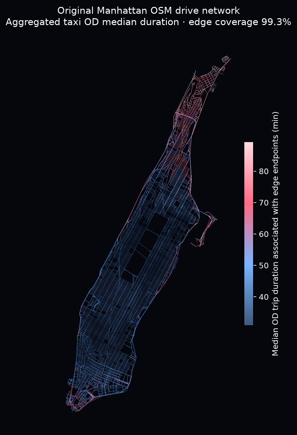
Figure 3: Original Manhattan OSM drive network. Edge colour is the median of the node-level hourly OD-pair median durations associated with street network.
I could have treated every hour in those six months as a separate state of Manhattan, but that would have produced thousands of noisy cartograms and a fairly unpleasant amount of computation.
Instead, I assumed that what I cared about was the recurring rhythm of a typical week. All Monday 9am journeys were pooled together, all Monday 10am journeys together, and so on, giving:
This gives each state substantially more observations while keeping the experiment computationally manageable. More importantly, 168 states are enough to preserve the temporal structure I actually wanted to study: weekday rush hours, quiet nights, Friday evenings, weekend afternoons, and the other recurring phases through which the city moves.
From travel time to geometry
For each of the 168 states, the taxi journeys provide sparse constraints on the road network. If travel between two observed locations takes longer than the baseline, those parts of Manhattan should be pushed further apart. If the journey is faster, they should be pulled closer together.
There is an important limitation here: the taxi data tells me how long a journey took from A to B, but not how much time was spent on each road segment in between. I could try to infer that by assuming a route and distributing the journey time along it, but then I would be modelling quantities I never actually observed.
So I took the problem more literally. From an optimisation perspective, what I actually have is a sparse collection of relationships between pairs of locations. Each journey tells me something about how far apart those two places should feel in travel-time space, without pretending that I know exactly where along the route the delay occurred.
The difficulty is that travel time alone does not know what Manhattan is supposed to look like.
If I simply ask an optimiser to reproduce those taxi-derived distances as faithfully as possible, it is perfectly entitled to rotate the island, reflect it, fold bits of the network over one another or invent some other mathematically excellent but geographically cursed version of New York.
I learned this the painful way during the first few weeks of trying to reproduce the animation.
So the original road network has to act as a geographic prior. The deformation should respond to the taxi data while retaining enough of the original street structure that Manhattan remains recognisably Manhattan.
Conceptually, this starts to look a lot like multidimensional scaling. For each hour, I have a sparse collection of pairwise, travel-time-derived distances and want to find new coordinates for the road-network nodes whose Euclidean distances reproduce those targets as closely as possible.
But fitting those distances alone is not enough. The optimiser also needs some encouragement to behave itself. In practice, I ask it to:
- fit the taxi-derived distances;
- preserve local road-edge structure;
- encourage neighbouring nodes to move together;
- softly anchor the result to the original geography.
This formulation is slightly more nuanced than the original post since I don’t have the edge-level observation. Essentially this would translate to:
“Given how geographically far apart these places already are, should they feel closer together or farther apart based on how long journeys between them actually take?”
One other choice was important.
I considered adding temporal smoothing so that, say, Monday at 08:00 would be encouraged to resemble Monday at 09:00. That would certainly make for a smoother animation.
But it would also bake part of the answer into the model.
Instead, I solve all 168 states independently. If 08:00 and 09:00 later turn out to have similar shapes, I want that similarity to emerge from the travel-time data — not because I quietly told consecutive hours to behave themselves.
Missing journeys remain missing too. I do not manufacture a dense matrix simply because matrices enjoy being square. The exact construction of the sparse constraints, objective function and regularisation terms lives in the technical notes at the end.
After several weeks of arguing with optimisers, road graphs and Codex, I finally had 168 independently deformed Manhattans.
And, more importantly, I no longer just had an animation.
I had 168 shapes that I could start comparing.
Manhattan starts Breathing!!!
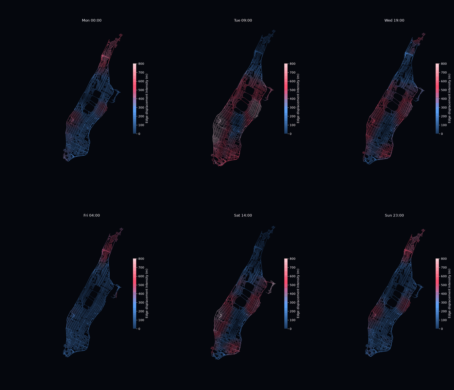
Figure 4: Canonical-week animation
The street network remained recognisable while undergoing substantial deformation. Because I deform the same underlying graph rather than reconstructing it from scratch, the road-network connectivity is preserved throughout. What changes is the position of the nodes: regions contract, expand and shift according to the observed travel-time constraints.
More surprisingly, neighbouring hours often look reasonably continuous, even though each of the 168 states is solved independently. There is no temporal regularisation, and one hour is never initialised from the previous one. The apparent continuity is therefore something that emerges from the data rather than something imposed by the solver.
A few patterns are hard to miss.
- During weekday daytime, roughly 09:00–17:00, the strongest deformation tends to concentrate around central and east-central Manhattan: Midtown and Times Square, the Upper East Side and the eastern edge of Central Park, with additional deformation in parts of Lower Manhattan. Northern Manhattan is comparatively compressed.
- Late in the evening and around midnight, the pattern changes substantially. The far north becomes more expanded, while much of central and lower Manhattan becomes relatively less displaced.
- Weekends also appear different from the weekday daytime regime. Saturday and Sunday around midday are less dominated by the strong Midtown–Upper East Side pattern.
Some of this is intuitive. The weekday expansion around Midtown corresponds reasonably well with Manhattan’s major employment and activity core.
The persistent Upper East Side deformation is more interesting. If this were simply a map of office concentration, I would not necessarily expect it to appear so strongly. The area combines dense residential activity, hospitals and major institutions, service activity, and the peculiar east–west constraints created by Central Park.
That made me wonder whether the deformation was picking up something closer to a functional accessibility region than a conventional land-use category.
The nighttime behaviour of northern Manhattan points in the same direction. Washington Heights and Inwood become much more prominent in the deformation after the daytime pattern subsides. One possible interpretation is that the effective relationship between the residential north and the rest of Manhattan changes as the city’s dominant activity structure changes through the day.
I would not want to read too much into individual frames, though. At this stage, these were still visual impressions from repeatedly watching a GIF for 20 minutes.
But one thing had become clear: the animation did not look like 168 completely unrelated distortions. Certain kinds of Manhattan seemed to recur.
One caveat is important here: displacement should not be read directly as congestion. The colour shows how far each part of the road network has moved from its original geographic position after fitting all of the travel-time constraints.
Imagine trips between Inwood and several parts of central Manhattan become much longer relative to the baseline. The optimiser needs those locations to sit farther apart in travel-time space. Because Midtown is tied into many other relationships and may remain relatively stable, the easiest solution can be to move Inwood substantially northward. In that case, Inwood appears red not because every road there is congested, but because its relationship to the rest of Manhattan requires substantial repositioning.
That was the point where this stopped being only a reproduction exercise.
Instead of asking:
What does Manhattan look like at each hour?
I started asking:
How many different shapes of Manhattan are actually hiding inside these 168 states?
Treating each cartogram as a shape
Once I had 168 cartograms, I stopped thinking of them as 168 separate maps.
Each road-network node has moved from its original position by some amount and in some direction. For node at time ,
Collecting these displacement vectors across all nodes gives an displacement field. For PCA, I flatten this field into a single (2N)-dimensional vector,
Each of the 168 canonical states is therefore one point in a high-dimensional deformation space.
I can then use PCA to ask a familiar shape-analysis question:
What are the main ways in which Manhattan deforms?
Separating intensity from morphology
To visualise each principal component, I animate the shape from one extreme of the mode to the other (See, technical details for more explanation).
At first, using purely the raw-displacement vectors, result was strikingly low-dimensional. The first principle component explained 84.9% of the variation and the first two components together explained 92.3%.
This looked like strong evidence that Manhattan’s cartographic deformations occupy a compact latent space.
But it also raised a concern.
What if PC1 was mostly measuring how much the entire map moved?
Two cartograms could have almost identical spatial patterns, with one being a stronger version of the other:
Raw PCA would consider them different even though their deformation morphology is almost the same.
So I compared three representations.
- Raw displacement
This preserves both deformation intensity and morphology.
- RMS-normalised displacement
Gives every cartogram the same overall displacement magnitude, so the analysis focuses more on where the movement happens and in which direction, rather than just how much movement there is.
- Procrustes shape
Here I aligned the final cartogram shapes after removing translation, rotation and uniform scale. This is the most aggressive attempt to isolate internal shape variation.
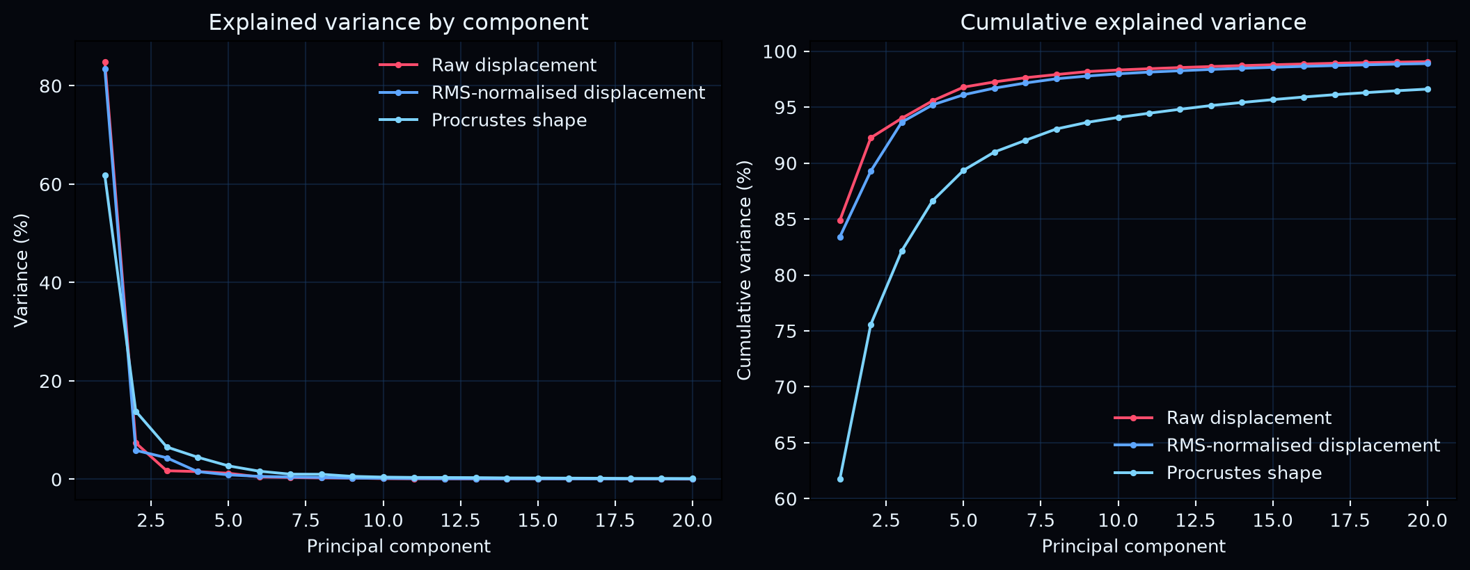
Figure 5: Explained-variance plots for all three representations
The first component explained approximately:
- 84.9% for raw displacement;
- 83.4% for RMS-normalised displacement;
- 61.8% for Procrustes shape.
Raw displacement required two components to reach 90% cumulative variance, RMS-normalised displacement required three, and Procrustes shape required six.
This was the part I found most encouraging.
If every temporal state were simply a stronger or weaker copy of the same deformation, RMS normalisation should have flattened most of the variation.
It did not.
The structure survived.
That suggests the city is not merely moving along one axis from “barely warped” to “very warped”. Different parts of Manhattan are moving relative to one another in recurring ways.
What do the deformation modes look like?
The two animations show the same PCA modes from different perspectives.
The moving-geometry version makes the resulting cartographic shape easier to see.
The vector version keeps the geography fixed and shows the direction of movement, which is often much better for understanding what the mode is actually doing.
A few patterns stand out.1
- PC1 is broad and coherent: Manhattan’s dominant longitudinal mode. In both the raw and RMS-normalised representations, large parts of the island move together along a strong north–south structure. Central and lower Manhattan expand relative to northern Manhattan, and the vector field shows that this is a coordinated deformation rather than a collection of isolated local changes. Its persistence after RMS normalisation is important: the dominant mode is not simply a stronger or weaker version of the same map, but a stable spatial pattern.
- PC2 bends the island rather than moving it as one piece. The vectors begin to point in different directions across upper, central, and lower Manhattan, producing a clear shear-like or bending mode. The moving cartogram shows the consequence of that differential motion as local expansion and contraction, while the fixed vector field makes the opposing regional movements easier to see.
- PC3 becomes more local. The broad island-wide coherence gives way to concentrated movement around particular parts of the network, especially central Manhattan and the transitions toward the upper and lower island. It explains less variance, but it captures finer spatial structure that is largely hidden beneath the first two modes.
- Procrustes turns global motion into internal morphology. Once translation, rotation, and uniform scale are removed, PC1 falls to 61.8%, while PC2 and PC3 account for a larger share of the remaining variation. The vector fields become less dominated by whole-island movement and more by relative motion between different parts of Manhattan. In other words, the Procrustes representation asks not “where did Manhattan move?” but “how did Manhattan change shape internally?”
This is exactly what I would hope to see if the representation contains genuine internal morphology rather than only global motion. Manhattan has many hourly cartograms, but PCA suggests that it has only a few characteristic ways of changing shape.
These modes are still descriptions of geometry, not causal explanations. A dramatic deformation around Midtown does not mean that PCA has discovered the latent spirit of Midtown. It means something more modest, and more useful: this is where the corresponding mode is strongly expressed. The next question is whether those spatial modes align systematically with the temporal rhythms and functional geography of the city.
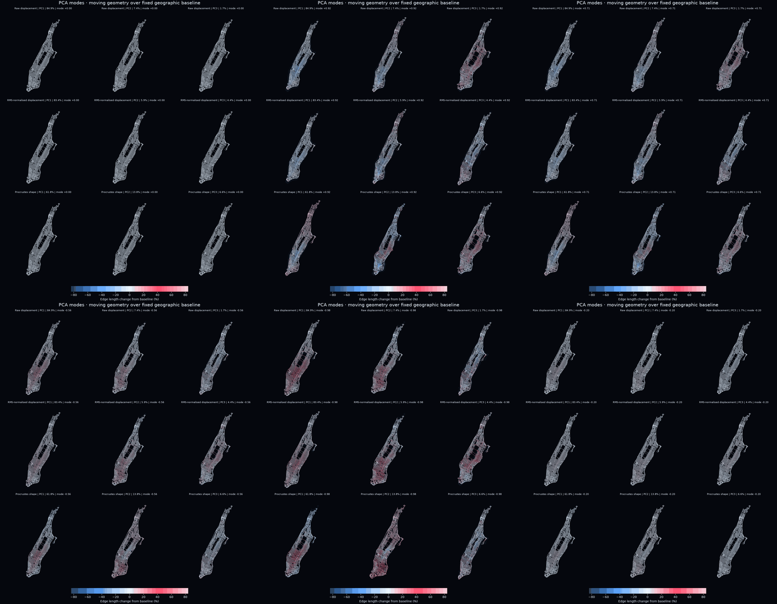
Figure 6a: Synchronised 3×3 PCA moving-geometry comparison. Rows show raw displacement, RMS-normalised displacement and Procrustes shape; columns show PC1–PC3. A faint network preserves the original geography while the brighter network moves through the negative and positive phases of each mode. Edge colour measures signed road-edge length change relative to the undeformed baseline: blue contracts, white changes little and red expands.
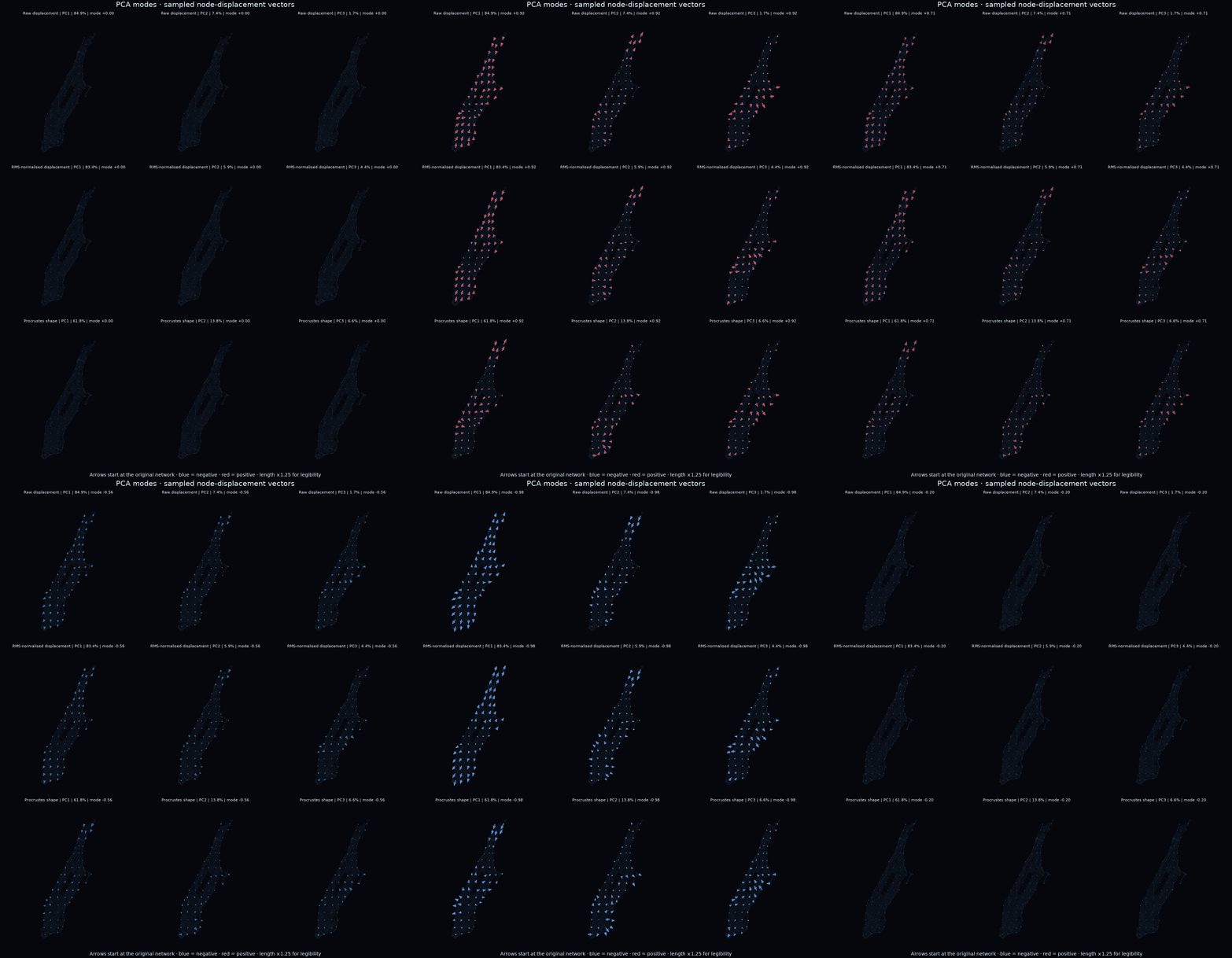
Figure 6b: Synchronised 3×3 PCA displacement-vector comparison. The street network remains fixed and spatially sampled arrows show the direction and relative magnitude of node movement. Blue arrows indicate the negative phase and red arrows the positive phase.
Do meaningful temporal states emerge?
The next question was whether similar shapes naturally group together. I clustered the PCA representations using HDBSCAN without giving it hour-of-day or weekday labels.
The clustering makes the temporal structure even more explicit! HDBSCAN identifies a large daytime cluster spanning roughly 09:00–18:00 and a second cluster covering late evening and overnight hours. Two much smaller clusters appear around 05:00 and 06:00, suggesting transitional geometries between the overnight and daytime states.
What I like about this result is that the clustering algorithm has no concept of a morning, a weekday or a commute. It only sees geometry.
The temporal structure appears afterwards.
The raw representation is more fragmented because it retains deformation intensity. The Procrustes representation produces subtler internal shape differences and leaves more states unassigned.
But this result needs a fairly large asterisk. These are clusters of 168 aggregated canonical states, not thousands of independent hourly observations. So the experiment shows that the canonical week contains distinct deformation morphologies. It does not yet show that those same regimes reliably recur on individual dates. That would require a proper held-out temporal analysis.
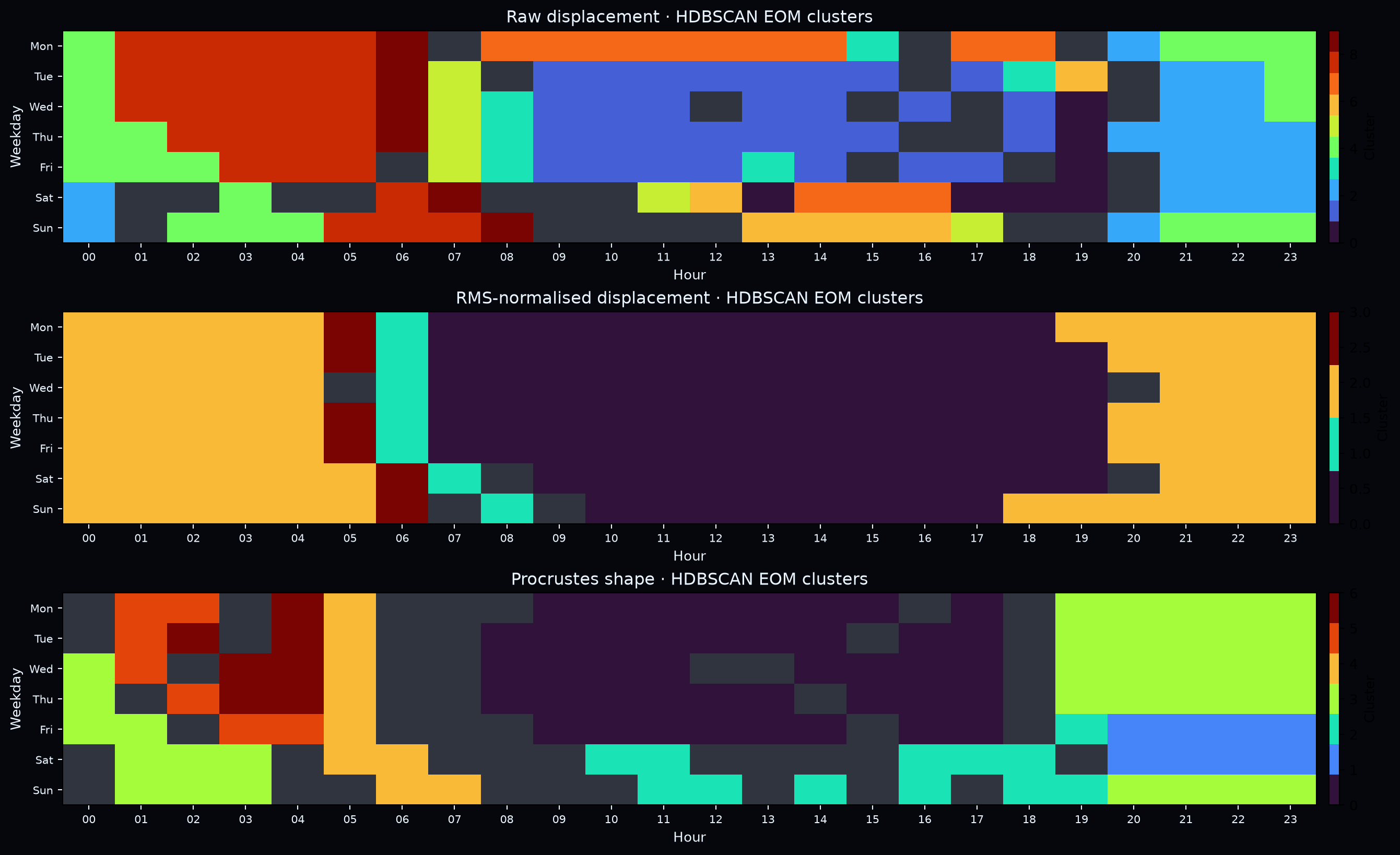
Figure 7: HDBSCAN EOM cluster calendars for the three representations
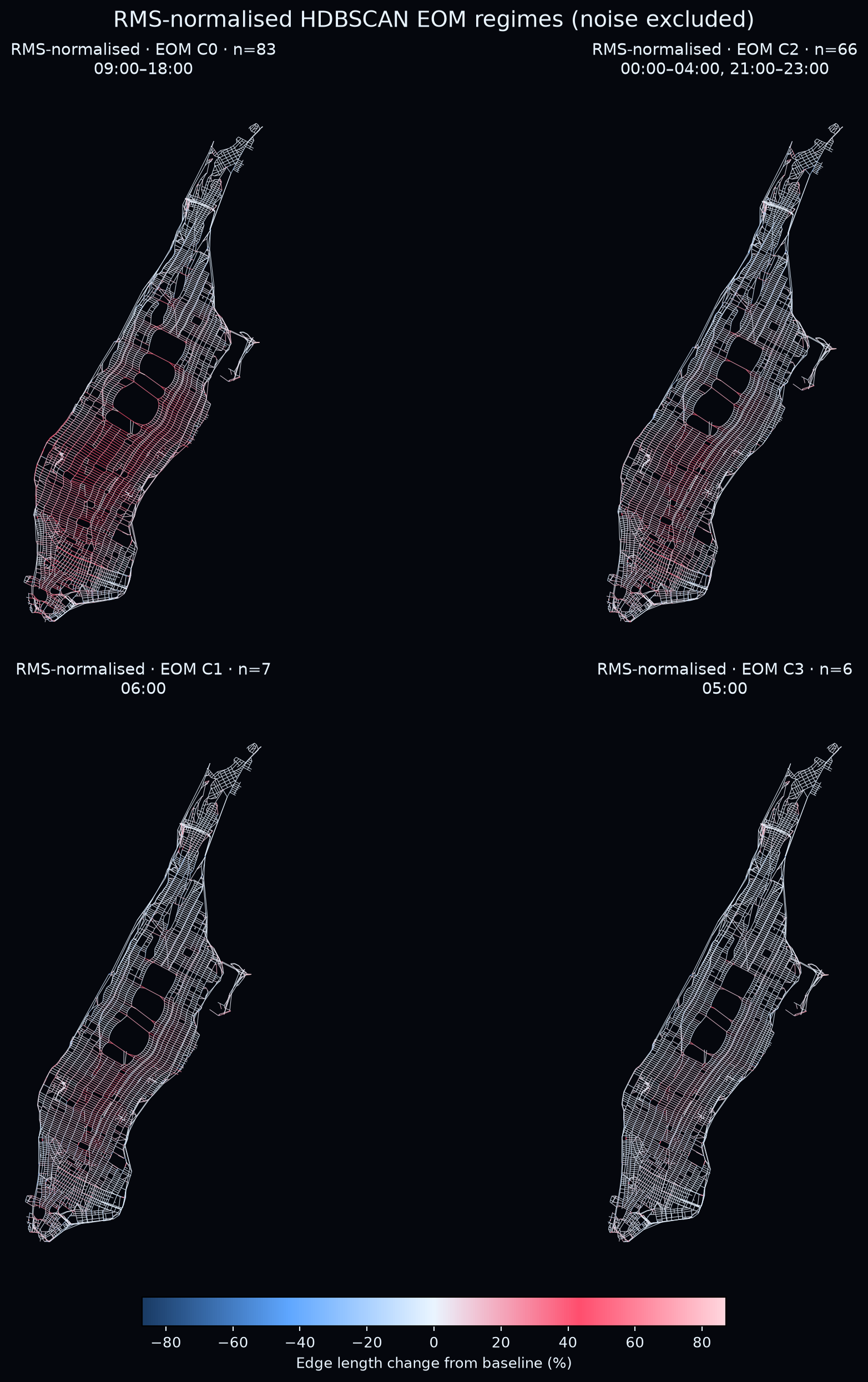
Figure 8: The four non-noise RMS-normalised HDBSCAN EOM regimes. Colour shows signed road-edge length change relative to the undeformed baseline: blue contracts, white is approximately unchanged and red expands
Is the cartogram now an analytical tool?
Cool analysis and what a rabbit hole!!!
Now back to my original question:
Could I treat each travel-time cartogram as one observed shape of the city, then study the recurring ways in which that shape changes?
Despite all the fun and crazy stuffs I have done, I do not think this experiment shows that cartograms should replace OD matrices.
A cartogram is deliberately lossy, and we should probably keep it that way.
Different travel-time matrices can produce similar geometries, and information about directionality, rare routes or local travel-time anomalies may disappear in the compression.
But that loss may also create a useful invariance.
Two traffic states produced by different combinations of roads and journeys may be analytically equivalent if they generate the same accessibility geometry. Conversely, relatively small OD changes may become visually important when they isolate or stretch a particular part of the city.
The cartogram acts as a geographically structured bottleneck:
What it preserves is not every journey. It preserves an approximation of how the city is geometrically experienced through every journey.
That makes the representation interpretable in a way that an arbitrary embedding dimension often is not. A principal component can be animated. A cluster can be rendered as a map. A latent direction can correspond to a visible redistribution of geographic space. That is harder to get from “dimension 7 of an embedding”.
A vocabulary of urban shapes
I began this experiment because I wanted to reproduce a strange and beautiful animation of Manhattan warping under changing travel times. What began as a visual curiosity gradually became a question about representation: could the deformation itself tell us something about the city?
The answer from this experiment is not definitive.
But it is encouraging!
The sequence of cartograms occupies a surprisingly compact deformation space. Raw displacement is dominated by a strong first principal component, but this is not simply the end of the story. After normalising overall displacement magnitude and removing global map scale, substantial low-dimensional structure remains. The city is therefore not only deforming by different amounts; different parts of it are moving relative to one another in recurring ways.
Clustering these representations without using hour or weekday labels also produces structured regions of the canonical week. Weekday daytime, late evening and weekend states often occupy different parts of the deformation space. These results do not yet establish a definitive taxonomy of Manhattan’s accessibility patterns, but they suggest that recurring temporal states have distinct geographic morphologies.
This leaves me with a different way of thinking about cartograms. Rather than treating them only as visualisations placed at the end of an analysis, we can treat their deformation fields as representations that can themselves be compared, decomposed and clustered.
There is an obvious next step: treating the displacement as a continuous deformation field and asking where the city expands, contracts, shears and rotates.
That sounds fun.
But I am deliberately not doing it here, because that will take another 4 weeks from my life.
For now, the result I find most interesting is simpler:
After separating deformation intensity from morphology, recurring low-dimensional spatial structure remains.
Perhaps a city does not have one fixed shape.
Perhaps it has a vocabulary of shapes.
SpatialDeform
I have released the code as SpatialDeform, including the data-processing pipeline, deformation solver, PCA analysis, clustering and visualisations.
SpatialDeform source repository
The intention is not to present a finished theory of urban morphology. It is to make the experiment reproducible and give other people a way to play with the idea.
Travel time is only one possible dissimilarity.
The same framework could potentially be applied to:
- public-transport accessibility;
- delivery cost;
- pollution exposure;
- healthcare access;
- housing affordability;
- communication latency;
- movement or migration probabilities.
Each metric would induce a different shape of the same geography.
Technical notes
Data and network construction
The active analysis uses the coordinate-bearing NYC taxi records from January to June 2016. Trips are retained if their duration lies between 60 seconds and three hours and both endpoints fall within the Manhattan boundary. Pickup and drop-off coordinates are snapped to the nearest nodes in a frozen OpenStreetMap drive graph containing 4,633 nodes. Corresponding weekday-hour observations are pooled into 168 canonical states.
Building sparse travel-time constraints
For each canonical state, directed median durations are calculated between snapped node pairs.
Reciprocal directions are combined using their observation counts to create one symmetric pairwise target.
The geographic baseline () is the shortest-path distance through the OSM network, weighted by edge length.
A global reference speed converts duration-derived values into metres.
Each observation is expressed relative to its geographic baseline,
then robustly clipped and shrunk toward the baseline.
The confidence weight is
and the final target becomes
Low-count observations therefore make only modest adjustments, while repeatedly observed pairs exert stronger influence.
Missing pairs remain missing rather than being filled into a dense OD matrix.
Sparse deformation objective
The implemented objective is
Here, is the original geographic coordinate of node , is the original length of road edge $(i,j)E$ is the OSM road-edge set.
The four terms play different roles:
- Travel-time fit asks the cartogram to reflect the observed accessibility state.
- Road-edge preservation prevents local street geometry from changing arbitrarily.
- Displacement smoothness encourages connected parts of the street network to deform coherently. This is effectively a graph-Laplacian regularisation on the displacement field.
- Geographic anchoring keeps the solution close enough to the original map to remain recognisable.
The parameters determine how much geometric freedom the taxi observations are allowed to introduce. Too little regularisation and sparse observations can create noisy local distortions; too much and the network becomes almost rigid, suppressing the very accessibility patterns we want to study.
Importantly, there is no temporal smoothness term in this experiment. Each of the 168 canonical hours is solved independently. If neighbouring hours end up producing similar cartograms, that similarity therefore comes from their estimated travel-time structure and the shared spatial priors—not from explicitly forcing one hour to resemble the next.
PCA
Each displacement field is flattened into a vector and PCA is applied across the 168 canonical states.
A state can be approximated as
For visualisation, component (k) is rendered between
and
The sign of a PCA component is arbitrary.
Limitations
This experiment is exploratory.
The canonical-week aggregation suppresses day-to-day variability, so cluster recurrence has not yet been validated on held-out dates.
Travel-time directionality is symmetrised because the cartogram operates in Euclidean geometry.
The deformation contains explicit spatial priors through road-edge preservation, graph smoothness and geographic anchoring.
The resulting cartogram is therefore not a direct reconstruction of taxi observations. It is a regularised geometric representation inferred from them.
Finally, a cartogram is inherently lossy: not every feature of the original OD system survives the transformation.
Footnotes
-
The sign of a PCA mode is arbitrary. Reversing from red to blue arrows does not mean that congestion becomes uncongested, nor does it imply a negative travel time; it simply reverses direction along the same PCA axis. Likewise, red and blue road colours indicate expansion and contraction of the displayed geometry, not observed taxi duration. Because the RMS-normalised and Procrustes representations deliberately alter scale, arrow lengths should be interpreted as displayed mode amplitudes rather than directly comparable absolute distances across all three rows. ↩