Turning “the model says so” into a curious, visual what-if experiment.
A street-view model can look at a photo and produce a score: safer, wealthier, livelier, more beautiful. Useful? Absolutely. Satisfying? Not quite.
If a model says a street feels unsafe, the natural next question is: why—and what could plausibly change that impression?
This project explores a more hands-on answer. Instead of highlighting suspicious pixels or drawing a heatmap over a whole image, it asks a small, concrete question:
What if we changed one believable thing in this exact street scene?
Maybe we repaint a faded crosswalk. Maybe we remove graffiti from one wall, clean a grimy storefront, repair a damaged façade, or add a little greenery beside an entrance. Then we compare the edited image with the original.
The goal is not to redesign a neighbourhood with one magical prompt. It is to find a set of modest, scene-specific “levers”—small visual interventions that are plausible enough to inspect, debate, and eventually test with people.
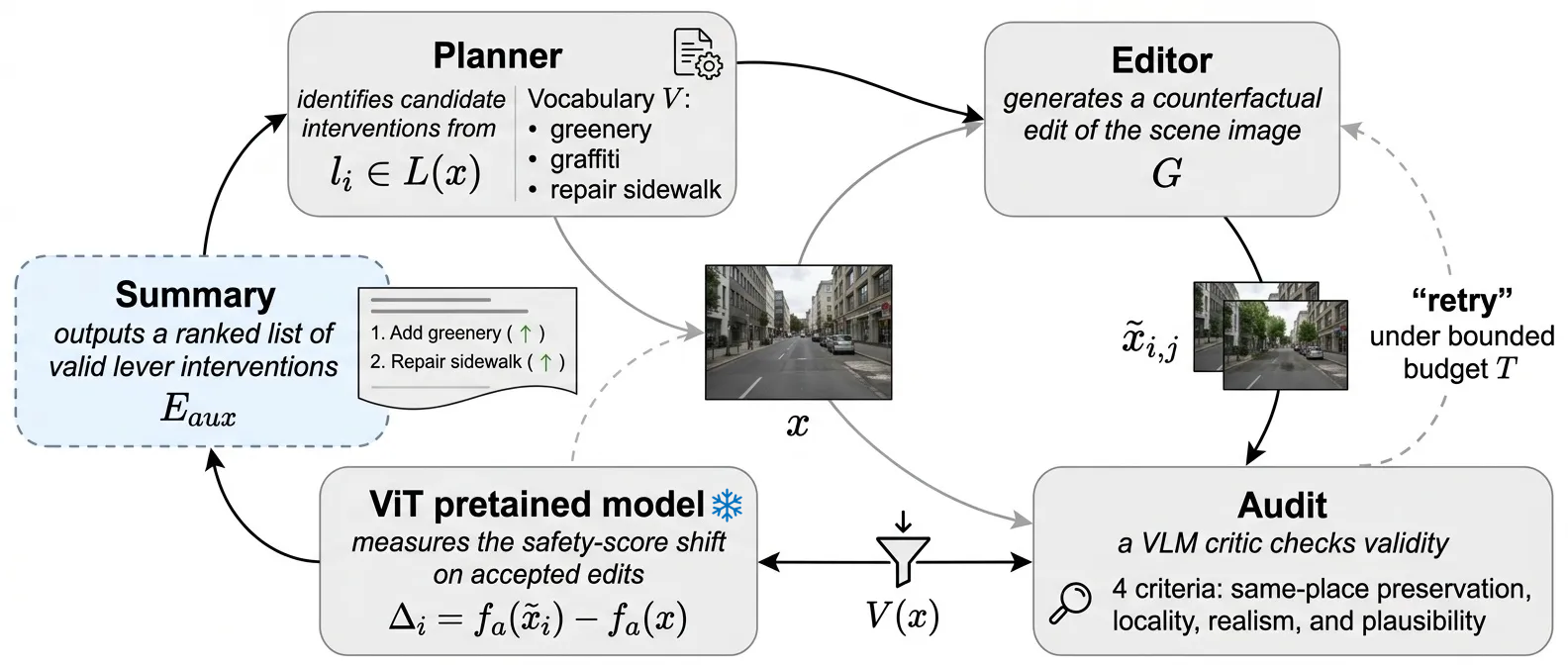
Figure 1. The pipeline treats every edit as a candidate experiment. A planner proposes a local intervention; an editor generates it; an audit decides whether it remains an eligible same-place comparison; only then is it scored.
What we are trying to achieve
The project has four deliberately practical objectives:
- Make explanations actionable. Replace “the model attended to this area” with a small, named intervention that a person can recognise and challenge.
- Make edits auditable. Retain only counterfactuals that preserve the same place, stay local, look realistic, and actually instantiate the requested lever.
- Learn what is feasible. Measure which interventions can be generated reliably under bounded prompt-only editing, rather than assuming every theoretically sensible change is renderable.
- Prioritise a human study. Use the auxiliary score only to identify the levers and scenes most worth testing with randomised human pairwise judgement.
The destination is not an automated urban-design oracle. It is a more disciplined loop for asking where a visual model’s intuitions hold up, where they fail, and which hypotheses deserve the attention of people.
Explanations should survive a “what if?”
Traditional visual explanations often tell us which parts of an image are associated with a prediction. A model may attend to a road, a tree canopy, shop signs, or the condition of a building. But association is slippery. A highlighted patch of pavement does not tell us what would happen if the pavement were cleaned, repainted, or left alone.
This project reframes explanation as a counterfactual:
- Keep the street recognisably the same place.
- Change one thing at a time.
- Make the change local and realistic.
- Ask whether the perception score moves.
That is a higher bar than “these pixels mattered.” The proposed change has to make sense in the scene.
A useful way to picture it is as an urban-design tasting menu. Rather than serving an entire makeover, each course contains one ingredient: repaint the lane markings; remove litter; repair lighting; add modest planting. Each is tested independently against the original image, so the result remains interpretable.
Not every edit earns the right to be an answer
Generative image editing is wonderfully imaginative—and that is exactly why it needs supervision here.
Ask an image model to repaint a crosswalk and it may decide the best solution includes a new road, a different building, three extra cars, and perhaps a slightly altered climate. That may look impressive, but it ruins the experiment.
So every candidate edit passes through a four-part audit:
- Same place: Does this still look like the original location?
- Locality: Did the intended area change, without the rest of the scene wandering off?
- Realism: Does the result look visually credible?
- Plausibility: Is this the proposed urban intervention, rather than a vague or unrelated improvement?
Only edits that pass all four checks are kept. This is important: an edited image is treated as a hypothesis to be audited, not as evidence simply because it was generated.
A pilot across five cities
The pilot sampled 50 street scenes—10 each from Amsterdam, Abuja, San Francisco, Santiago, and Singapore—and generated up to five candidate levers per scene.
The result was encouragingly messy in the useful, scientific sense:
- 250 candidate edits were proposed.
- 177 passed the validity audit: about 71%.
- Every scene retained at least one valid edit.
- 40 of the 50 scenes had at least one edit that cleared the project’s exploratory proxy threshold.
The strongest practical lesson is that some ideas are simply easier to realise faithfully than others. Road-marking and maintenance changes tended to work reliably. Lighting repair was a more stubborn failure mode: small lights are easy for a generative editor to miss, distort, or turn into a broader scene change.
That may sound like a technical footnote, but it is part of the finding. If we want tools that help explore urban perception, we need to know not only which interventions look promising, but which can be rendered and checked honestly.
Three edits that made the cut
The retained examples below make the framework tangible. Each row compares the original scene with a version containing one deliberately local edit. The red dashed outline marks the intended support; the faded surrounding context makes it easier to see whether the editor stayed disciplined.
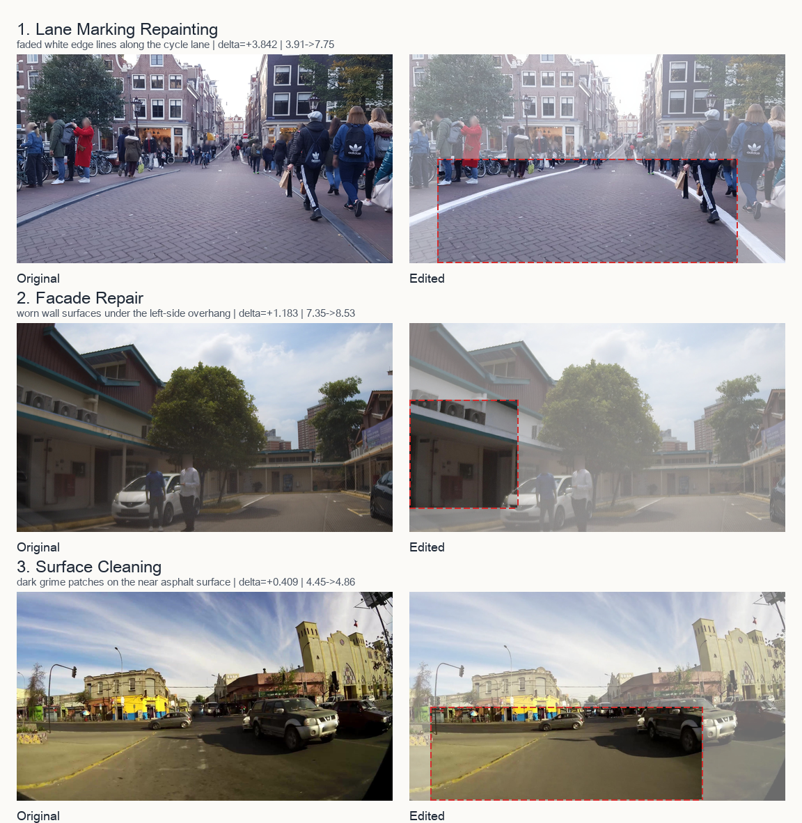
Figure 2. Three accepted edits: lane-marking repainting in Amsterdam, façade repair in Singapore, and surface cleaning in Santiago. These are visual examples, not proof that the intervention changes human perception.
The Amsterdam lane-marking example is pleasingly modest: refresh a worn cycle-lane edge without rewriting the street. The Singapore façade repair makes an even more precise point: the intervention is not “make the area nicer,” but repair a specific visibly worn surface. And the Santiago surface-cleaning example asks whether a small change to pavement condition can affect a broad impression of care.
The ones that failed are just as instructive
The audit is not ceremonial. It rejects edits that change the wrong thing, drift away from the requested support, or make the scene less believable. Here, a crosswalk appears where no crosswalk should be, shrubs arrive in the wrong patch of verge, and a request for transparency produces an implausibly black storefront.
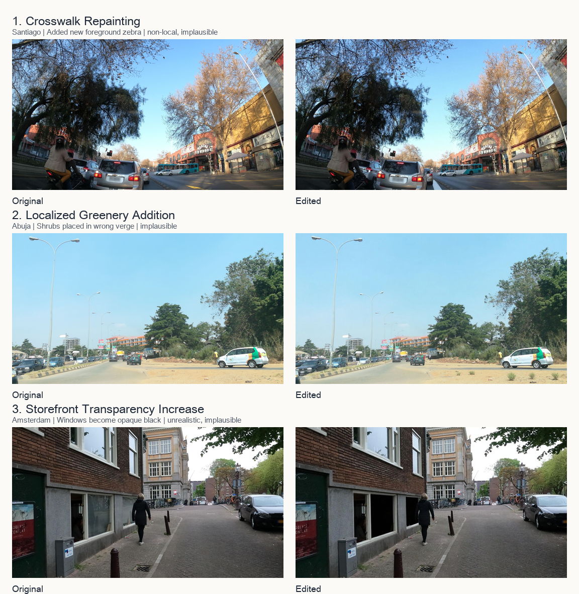
Figure 3. Rejected edits expose the failure modes that a pleasing before-and-after image can hide: non-local changes, misplaced interventions, and unrealistic results. They do not enter the score analysis.
The surprise: crosswalk paint moved the safety proxy
For accepted edits, the project measured the difference between the original and edited scene using a safety classifier trained on Place Pulse-style perception data. This is an auxiliary signal—not a substitute for human judgment—but it helps decide what to investigate next.
The overall average change among valid edits was positive: +0.366 on the model’s 0–10 safety scale.
The most consistently positive family was Mobility Infrastructure:
- Crosswalk repainting: +0.767
- Lane-marking repainting: +0.485
- Family average: +0.579
Physical maintenance was the broadest consistently positive group: graffiti removal, litter removal, façade repair, and surface cleaning. Together, these interventions averaged +0.344.
At first glance, the crosswalk result feels intuitive: clear markings signal care, order, and a street designed for people. But it also raises a deliciously awkward question. Is the model responding to perceived crime safety, which is the intended concept? Or is it reacting to a visual shortcut: “well-marked roads look safer,” perhaps because they suggest traffic safety, municipal investment, or general order?
That ambiguity is not a bug to hide. It is precisely the kind of question this framework is meant to surface.
A graph worth reading slowly
The graph below asks a useful question: as we demand a larger positive score change, how many valid levers remain per scene? The dashed line marks the exploratory operating threshold, θaux = 0.1. On the left, Physical Maintenance starts with the most retained candidates at low cutoffs; on the right, the city curves show that the positive tail is not evenly distributed across the five sampled locations.
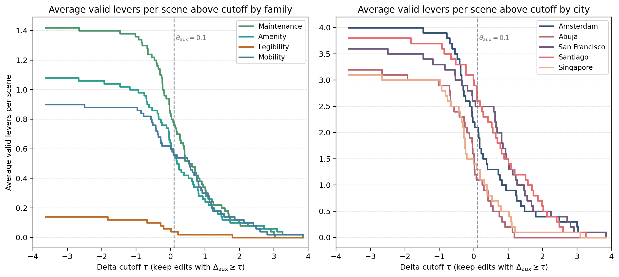
Figure 4. Average number of valid levers per scene above each auxiliary score cutoff. This is a prioritisation plot: it shows what remains promising under the proxy, not a human-effect estimate.
Two details are especially useful. First, the family ordering changes as the threshold gets stricter, so a broad pool of plausible edits is not the same thing as a strong positive tail. Second, the city-level differences are a reminder that a lever is never completely abstract: a freshly painted line, a façade repair, or added planting has to be interpreted within the geometry and visual culture of a particular scene.
Greenery helps—until it doesn’t
The environmental-amenity findings show why looking beyond a single average matters.
Adding local greenery had a strong positive average proxy shift: +0.650. But tree-canopy management—trimming overgrown canopy to improve visibility and sightlines—was slightly negative on average.
One plausible explanation is that the proxy has learned a broad visual prior: more green equals safer. That may be a decent shortcut in its training data, yet it is not the whole urban story. In a real street, carefully trimming vegetation can make a pathway more visible and improve a person’s sense of surveillance.
This is where counterfactuals become more interesting than a leaderboard. They reveal not only what a model likes, but where its instincts may be too simple.
The human question still matters most
The project is admirably clear about what it has and has not established. A score change from an auxiliary classifier is not proof that people would feel safer.
The next step is a human pairwise study: show participants the original and the edited image in random order, and ask a simple question such as, “Which image looks safer?” The audit remains essential: people should compare credible, local interventions—not accidental city-scale transformations.
Until then, these results are best understood as a prioritisation map. They point to the interventions worth sending to people first:
- road markings and crosswalks,
- upkeep and maintenance,
- small, context-sensitive greenery additions, and
- the cases where the model’s answer clashes with urban-design intuition.
Technical notes: how the pipeline stays honest
For readers who want to look beneath the hood, the codebase is deliberately opinionated about what counts as a candidate and what counts as a result.
- A closed vocabulary keeps the question bounded. The planner can choose from 12 levers across Physical Maintenance, Environmental Amenity, Visual Legibility, and Mobility Infrastructure. It must name a visible scene support, target object, direction, and a concise edit plan. Concepts invented on the fly are discarded rather than quietly mapped to the nearest label.
- One original, one lever, no compounding. Every candidate is generated and compared with the same untouched source image. The pipeline does not stack “clean pavement, then add plants, then brighten the scene” into an irresistible makeover; that would make attribution ambiguous.
- The generator is constrained by prompt, not masks. The current baseline uses prompt-conditioned image editing with explicit instructions to preserve camera viewpoint, geometry, background, and non-target objects. It has a bounded retry budget, so a difficult lever cannot keep drawing samples until it gets lucky.
- Validity is an eligibility gate. A vision-language critic returns structured checks for whether an edit was attempted, preserves the same place, is localised, looks realistic, and is plausible for the named lever. A single failed condition keeps the edit out of the reported effect summaries.
- Scoring is deliberately secondary. Accepted edits receive a safety delta,
edited score − original score, from a locally run ViT-B/16 Place Pulse perception proxy. The threshold is exploratory, and the code keeps those “auxiliary” labels explicit so a model score is not mistaken for the eventual human outcome. - Outputs are traceable. Candidate-level CSV rows preserve the lever identity, scene support, prompt plan, audit decision, failure diagnosis, retry counts, and score delta. That makes it possible to inspect a compelling result—and, equally importantly, a suspicious one.
There is a useful restraint embedded in those choices: this is constrained interventional search, not causal proof that repainting a line or cleaning a surface would change a real neighbourhood. The images are a way to formulate and filter hypotheses before asking people.
From heatmaps to hypotheses
The larger idea is simple: explanations should be things we can argue with.
A heatmap says, “Look here.” A counterfactual says, “What if we did this?”
That shift turns explainability into a more grounded conversation between machine learning, urban design, and human perception. It trades the false certainty of a coloured overlay for something more useful: a concrete proposal, an image-based test, a validity check, and an invitation to ask better questions.
After all, if an AI says a street feels unsafe, the most interesting response is not “show me the pixels.”
It is: what would you change—and would a person agree?
Further reading
This pilot sits in a longer conversation. Place Pulse established a large-scale way to collect pairwise street-perception judgements; SPECS extends the question by studying how demographic and personality differences shape those perceptions. And long before either dataset, Jane Jacobs argued that a street’s social meaning lives in its everyday, observable details.
Those sources do not license a model to declare that one visual cue causes safety. They do make a compelling case for studying street perception carefully—and for keeping people, rather than proxies, at the end of the loop.
References
- Counterfactual StreetView. [Project repository and 50-scene pilot analysis]
- It’s not you, it’s me — Global urban visual perception varies across demographics and personalities. Available at: https://arxiv.org/abs/2505.12758. [Quintana et al.; introduces the SPECS dataset used for the pilot scenes]
- Deep Learning the City: Quantifying Urban Perception at a Global Scale. Available at: https://arxiv.org/abs/1608.01769. [Dubey et al.; Place Pulse 2.0 and pairwise urban-perception modelling]
- The Collaborative Image of the City: Mapping the Inequality of Urban Perception. Available at: https://journals.plos.org/plosone/article?id=10.1371/journal.pone.0068400. [Salesses, Schechtner, and Hidalgo; the original Place Pulse study]
- The Death and Life of Great American Cities. Available at: https://www.penguinrandomhouse.com/books/86058/the-death-and-life-of-great-american-cities-by-jane-jacobs/. [Jane Jacobs; a foundational account of how people experience city streets]
Footnotes
Pilot scope
The reported score shifts come from an auxiliary perception classifier, not a completed human study. Human pairwise judgements remain the intended ground-truth endpoint.
Technical stance
Each lever is evaluated independently against the unchanged original. The framework is constrained counterfactual search, not pixel attribution or proof of a causal urban intervention.